


The Art of Color Curating
COCORY JOURNAL 4-3
What does it really mean to find the colors that suit you?
Is personal color analysis simply about deciding whether red, blue, or green looks best?
We usually describe colors with familiar names, but those names don’t always bring the same image to mind.
One person might imagine a soft pink when they think of red. Another may picture a vivid red, while someone else thinks of a deep, muted shade.
These colors can belong to the same broad hue family, yet look completely different.
To understand why, we need to consider two dimensions: hue and tone.
Hue describes the color family and its direction. Tone describes the relationship between lightness and chroma—how light or dark, vivid or subdued a color appears.
In our previous journal, 4-2. Finding Your Range of Lightness and Chroma, we explored how these characteristics help define a person’s suitable tone range.
Now, we’ll add another dimension: hue.
Across the color spectrum, which hues work well for you, and how can we understand the range they create?
01. Hues Exist on a Continuum
One of the most established ways to organize color is the Munsell color system.
The Munsell hue circle contains five principal hues—red, yellow, green, blue, and purple—and five intermediate hue categories.
Together, they form ten fundamental hue divisions:
Red (R) → Yellow-Red (YR) → Yellow (Y) → Green-Yellow (GY) → Green (G) → Blue-Green (BG) → Blue (B) → Purple-Blue (PB) → Purple (P) → Red-Purple (RP)
Red-purple connects back to red, completing the circle.
The important idea is that these categories do not represent disconnected groups of colors.
Hue changes continuously. Between red and yellow-red, or between blue and purple-blue, there are numerous intermediate variations.
The ten Munsell hue divisions provide a framework for organizing this continuity rather than limiting all colors to ten fixed samples.
The system also allows for more precise distinctions within each hue category.
So why are ten basic hues useful in personal color analysis?
Because comparing every possible color individually would be impractical.
At COCORY, representative colors from the ten hue categories provide a starting framework for comparison. Where necessary, more subtle hue differences can then be explored.
The objective is not to choose one winning hue out of ten.
It is to understand which directions and ranges of hue connect naturally with an individual’s appearance.

02. One Hue Can Look Completely Different Across Tones
Identifying a hue is only part of understanding a color.
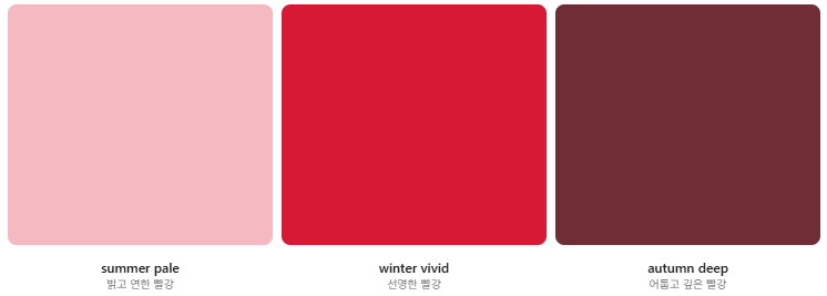
Even within the red family, differences in lightness and chroma can create remarkably different colors.
Consider these examples:
- summer pale + R: a light, delicate red that may appear pink
- winter vivid + R: a highly vivid, striking red
- autumn deep + R: a dark, deep red reminiscent of reddish autumn leaves
These examples illustrate how colors within the red hue category can have very different tonal characteristics.
Of course, their exact hue classifications depend on the actual color samples. Everyday descriptions such as pink or autumn-leaf red are not precise enough to establish a Munsell hue designation on their own.
The same principle applies to purple-blue (PB).
A light, subdued purple-blue and a deep, dark purple-blue can look very different, even when they belong to the same basic hue category.
This is why hue and tone need to be considered together.
Hue tells us where a color belongs in the color spectrum. Tone tells us about its lightness and chroma characteristics.
Neither dimension fully describes the color by itself.
03. COCORY Reads Color Through Both Hue and Tone
Color names can be subjective.
Terms such as soft green, bright red, or deep navy may suggest different colors to different people.
To make color descriptions more consistent, COCORY combines hue classification with its tone system.
Our CCCS (COCORY Color Curating System) uses a 12-tone framework to organize colors according to their lightness and chroma characteristics.
These tones can then be paired with hue categories.
For example:
- summer pale + R: a light, pale red
- winter vivid + R: a vivid red
- autumn deep + R: a deep red
- winter dark + PB: a dark purple-blue or navy-like color
These combinations are illustrative descriptions. The classification of an individual sample must be checked against its actual color properties.
Reading color through hue and tone allows us to distinguish variations within the same hue family while also recognizing different hues that share similar tonal characteristics.
It offers a more systematic vocabulary than relying on subjective color names alone.
However, classifying a color is not the same as determining whether it suits someone.
Color classification describes the color. Personal color analysis evaluates its visual relationship with the person.
04. Suitable Color Ranges Can Take Different Shapes
In the previous journal, we explored the range of lightness and chroma that may work well for an individual.
But not every hue within a suitable tone range will necessarily produce the same response.
And sometimes, one hue range may work well across several different tones.
This means that the relationship between hue and tone may take different forms from person to person.
1. A Range of Hues That Works Across Multiple Tones
Some people may find that a particular direction of hue continues to look harmonious even as lightness and chroma vary.
For example, colors extending from blue-green (BG) through blue (B) to purple-blue (PB) may work well across several tones.
In this situation, the direction and continuity of hue can be an especially useful guide.
2. A Range of Tones That Works Across Different Hues
For another person, a shared range of lightness and chroma may be more significant than the hue itself.
Red, green, blue, and other hue families may all offer suitable colors when they share similar tonal characteristics.
Here, the common tone range may be the more useful starting point for choosing colors.
3. Separate Hues That Work Well Independently
Suitable hues do not always form one continuous section of the color wheel.
A person might find harmonious colors in red (R), green (G), and purple-blue (PB), even though those categories are separated from one another.
Each hue may also have a different suitable tone range.
This is why we should not assume that only neighboring hues can work well for the same person.
4. A Combination of Hue and Tone Patterns
In practice, these characteristics may overlap.
One hue family may work across a broad range of tones, while another may appear harmonious only within a narrower lightness and chroma range.
Certain tonal characteristics may also produce favorable responses across several different hue families.
These examples are not four fixed personal color types.
They demonstrate that a person’s suitable color range does not have to follow one predetermined pattern.

05. Finding These Relationships Is the Art of Color Curating
How do we identify which of these relationships applies to an individual?
At COCORY, color curating begins by organizing colors systematically, then comparing their visual effects in practice.
The ten basic hue categories provide reference points for exploring hue directions.
Tone variations allow us to compare differences in lightness and chroma within a hue, as well as similar tonal characteristics across different hues.
During physical fabric draping, we observe how the colors interact with the face.
We consider whether the color connects naturally with the overall appearance, whether the skin appears lighter and more vibrant, and how evenly and smoothly the skin is perceived.
These observations are distinct from simply measuring skin color.
Skin color measurement describes the skin’s current color characteristics. Personal color curating evaluates the visual relationship between a person and the colors placed near the face.
By examining the comparison results together, we can begin to understand both the person’s suitable hues and the tones within which those hues work well.
Rather than stopping after identifying a few best colors, this approach asks broader questions.
Which hues remain harmonious across several tones? Which tonal characteristics work across multiple hues? And where does a particular color become less suitable as its lightness or chroma changes?
For COCORY, color curating is the process of interpreting these relationships to identify a useful, individualized range of colors.

06. A Useful Color Range Matters More Than One Best Color
Understanding these relationships can make everyday color choices more flexible and precise.
If a continuous range from blue-green to purple-blue works well across several tones, you may have a wide selection of lighter, softer, deeper, or more vivid colors within that hue range.
If a particular range of lightness and chroma works well across multiple hues, you can explore red, green, blue, and other colors while maintaining those shared tonal characteristics.
And if separate hue families work well independently, you can explore the suitable tone range within each one rather than restricting yourself to a single section of the color wheel.
No single pattern is inherently better than another.
What matters is understanding how your own suitable color range is formed.
Our previous journal explored lightness and chroma. This journal adds hue.
Tone helps us understand the lightness and chroma of a color. Hue helps us understand its position and direction within the color spectrum.
Personal color curating connects these dimensions through direct visual comparison.
Knowing which colors suit you is not simply about remembering a season or a handful of recommended shades.
It’s about understanding which colors you can choose, and how their lightness and chroma influence the way they work for you.
NEXT JOURNAL
4-4. 어울리지 않는다고 생각했던 색도 활용할 수 있을까?
Can You Wear Colors Outside Your Best Range?
Once you understand your suitable range of hues and tones, another question naturally follows.
What happens to the colors outside that range?
In our next journal, we’ll explore how colors that appear less harmonious near the face can still be incorporated into everyday styling, and how color placement and combinations can expand your options.
EDITORIAL NOTE
COCORY JOURNAL documents personal color not simply through seasonal types or trends, but as a framework for understanding the relationship between people and color.
Drawing on color theory and observations developed through practical analysis, we explore how we see, compare, and interpret the colors of each individual, one step at a time.
COCORY Color
사람을 위한 색의 기준을 세우다.
Making Color Work for Everyone


